
New Provincial Logo Unveiled
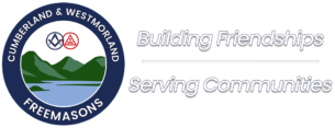
The Province of Cumberland & Westmorland has unveiled a refreshed Provincial Logo, reflecting recent changes in structure and a modern approach to presenting Freemasonry.
Assistant Provincial Grand Master David Bowden explained, “The harmonisation of the Craft and Royal Arch provided the perfect opportunity to refresh our logo and ensure it reflects our shared identity in a way that works for today’s audiences.”
Working with Provincial Communications Officer Neil Dixon and Provincial Webmaster Guy Newbold, the redesign coincided with preparations for the Province’s first social media campaign, highlighting the need for a clear, unified brand across digital, print, and event platforms.
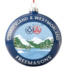
Utilising Guy’s technical skills the updated design retains key Masonic symbols and regional imagery but adopts a cleaner, flatter style for greater clarity and adaptability. As Neil Dixon noted, “A modernised logo brings together all our media under one recognisable identity that works seamlessly on web, mobile, and print.”
Guided by feedback from younger members and best practice from the United Grand Lodge of England, the new logo balances tradition with modernity, ensuring strong Masonic identity, clear regional connection, and effective representation of Craft–Royal Arch unity.
The revised design features:
- Strong Masonic identity through well-proportioned Square & Compasses and Triple Tau.
- Regional connection via stylised landscape and lake imagery.
- Clean, adaptable layout for all media formats.
- Legible typography at any size.
- Balanced inclusion of Craft and Royal Arch elements to symbolise harmony.
The new logo will feature prominently in all Provincial communications going forward, reinforcing a united and forward-looking identity.